Stu James, Lead UX/UI Designer, AppyWay
I joined AppyWay 3 and a half years ago, bringing with me 9 years of experience as a Cartographer and 10 years of experience as a UX & UI Designer. The chance to work on a suite of products where I could utilise experience from both roles was a perfect fit.
What is UX & UI Design?
“UX” refers to user experience. User experience is the overall experience a user has with a company’s products or services. Good and bad user experience design is determined by how easy or difficult it is to interact with each element or aspect of a product or service. UX designers conduct market research and analysis to educate themselves about customer’s needs and desires before designing the functionality of a product.
“UI” is short for User Interface. User interface design is focused on the look and layout — how each element of the product will look, including typography, imagery, graphics, colour palettes, button styles, animations and any visual interface elements people interact with. UI designers focus on a product’s aesthetic aspects to ensure websites, applications and software look neat and clean while still being intuitively functional to the user.
My role as Lead UX & UI Designer spans the full product design process from clearly defining the problem, designing and developing a proper solution for that problem and validating the solution with real users.
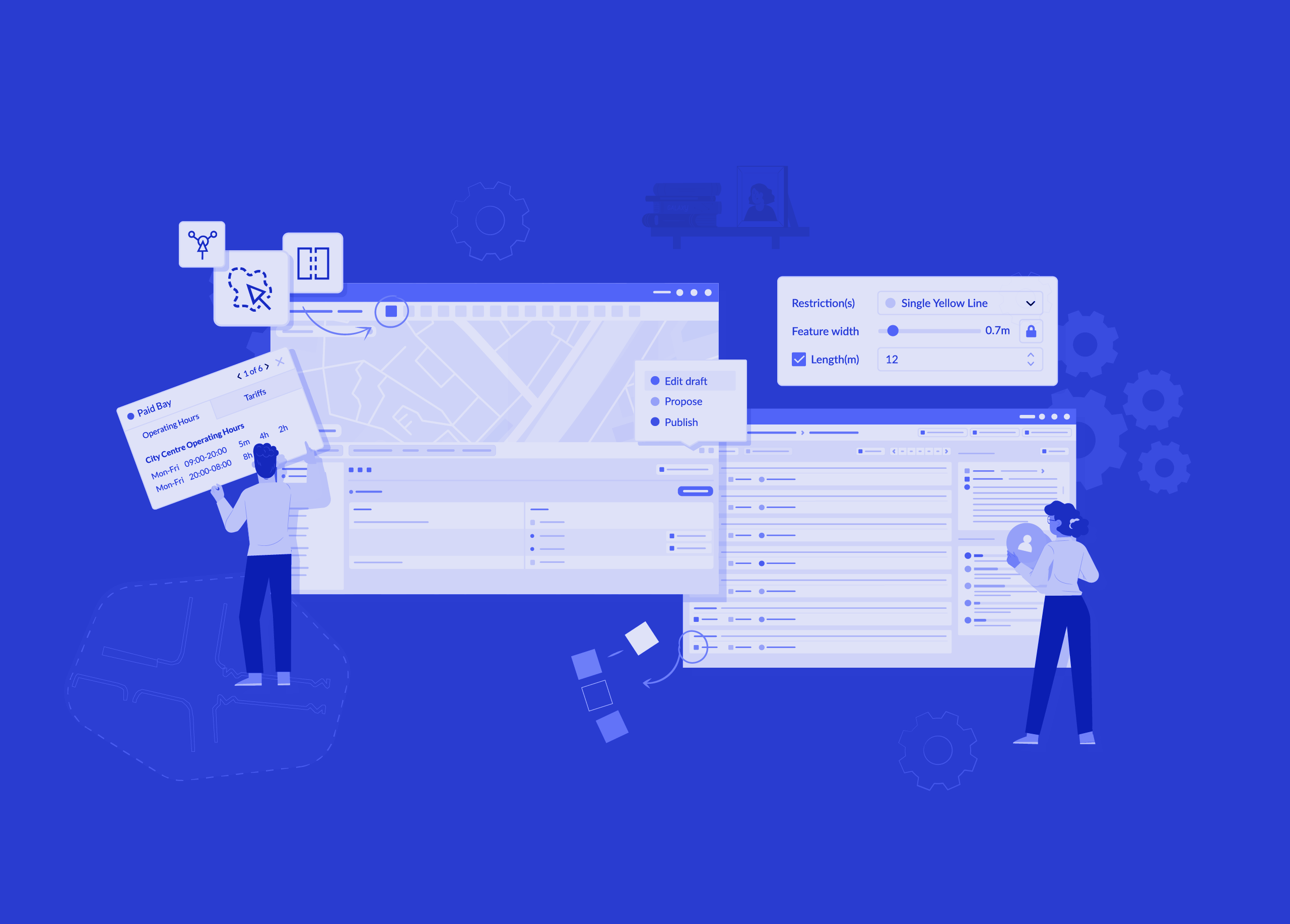
Alongside work on our mobile apps, data dashboard and website I have been a key part of the product development team that built our traffic order suite.
Defining the problem
The local authority traffic order process has historically been long, cumbersome and disjointed. Many councils still undertake a paper-based process rather than a digital one, with some still stamping documents with a wax seal. Those that have migrated to a digital platform are often finding the process just as long as paper due to poor UX and UI. Thankfully, through InnovateUK funding, and collaborative workshops with Coventry City Council, Cambridgeshire County Council, Westminster Council and Milton Keynes Council, the team and I were able to dramatically improve traffic order management experiences.
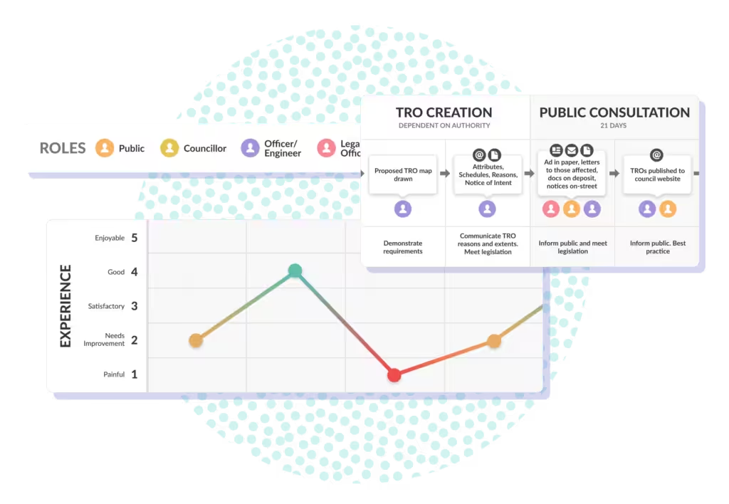
The crucial first step to define the problem we were trying to solve was to map out the entire traffic order journey, every step, every function, every pain point. The traffic order process has many stages and involves multiple departments who use a variety of software applications. The process can take months, even years to complete and every authority does things differently so this was no small feat.
Designing a better traffic order experience
This customer journey map enabled us to pinpoint parts of the journey where either the user experience or user interface was increasing traffic order processing times, hindering progress and potentially increasing local authority costs. Improving these experiences ultimately formed the basis for what is now Mapper, Engagement and Streets, which make up our Traffic Suite and are packed full of time-saving, intuitive features.
Starting with Mapper, the development team and I adopted an Agile process and worked in iterative “sprints”. These are short, repeatable phases, typically one to four weeks in length. Each sprint should result in a draft, prototype or workable version of a feature or collection of features.
The purpose of sprints is to break down a project into bite-sized chunks. This enables the team to plan a single sprint at a time, prioritise features and adapt future sprints based on the outcome of the sprints already completed.
The local authorities then used the new features in a real-world, testing environment, afterwards providing detailed feedback for us to tweak and improve. The feedback sessions were invaluable and ensured we created products that not only solved the core user need but were also intuitive to use, aesthetically clean and uncluttered, and ultimately improved upon the existing process by saving local authorities time, resources and money.
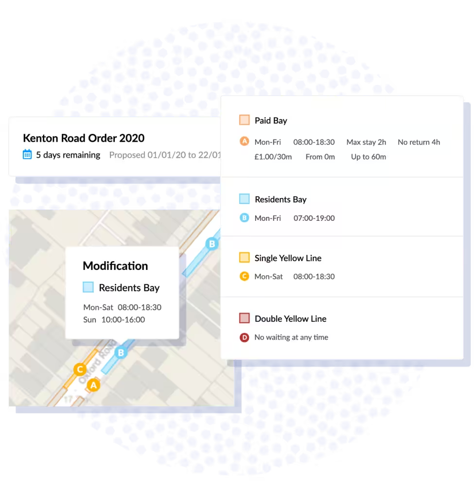
One clear, standardised map for all
Traffic order maps are typically very complex and difficult to understand, particularly for the public. We did a huge amount of work to ensure they are as clear and easy to understand as possible, for all users.
This included evaluating the frequency of use of all restriction types across all authorities. The top 6 restrictions account for 90% of all restrictions so we focussed on those first. As we provide a number of different OS basemap styles, some dark, some light we needed to ensure that all restriction colours worked on all basemaps and that each restriction colour was noticeably unique to meet accessibility standards.
20% of the population have accessibility issues, such as poor visibility or colour blindness, rising to 60% in pension-age adults. We also considered international markets and honoured existing conventions where possible. This, when combined with our smart, automatic labelling system, proved to be 85% easier to understand in testing when compared with existing solutions.
Building the Traffic Suite
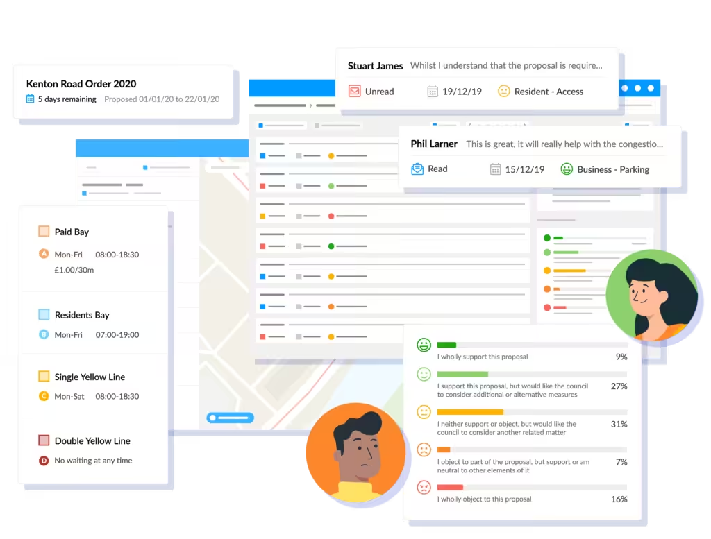
In later sprints we built our innovative Public Consultation portal and Engagement Dashboard. These additional products dramatically improve how the council engages with the public on schemes, and how they collect and evaluate feedback. Traffic orders can be pushed to Public Consultation with the click of a button and feedback is automatically categorised in the Engagement Dashboard, neither of which are possible with existing competitor solutions.
Whilst Public Consultation allows users to feedback on proposed restrictions, we have also created Streets, which allows anyone to view active restrictions. Any user, whether it be the public, local authority, police force or anyone else can immediately see the restrictions as they exist on-street, from any device, at any time. At the time of writing we are designing and building the ability to request suspensions and amendments to restrictions which will ultimately feed into the Engagement Dashboard.
Additional features include expert drawing tools, bulk editing, automated schedules, dynamic map tiles, moving traffic orders, historical queries, a full audit trail, statistical reports and many more. All of these features have been fully researched and tested to provide the optimum user experience.
Realising the benefits
Mapper, Public Consultation, the Engagement Dashboard and Streets form our traffic suite which covers the full end-to-end traffic order process. We have eliminated the convoluted and fragmented processes of the past and have created a combination of products that simplify and standardise the entire traffic order process, saving local authorities a huge amount of time, money and stress.
On-boarding and training becomes much easier when the tool is intuitive to use and is built entirely with the user at its heart. Local authorities have been positive throughout testing, immediately recognising the time and cost savings whilst also playing a pivotal role in helping us shape the products.
In the final report from InnovateUK, we were able to report time savings of up 83% when compared to other solutions and processes. Such dramatic savings can only be achieved by listening to users, conducting user testing, evaluating feedback and continually improving the UX and UI. InnovateUK praised the project, stating:
”The product demonstrated at the closure meeting is the most complete and ready to exploit that we have seen at any of our other closure meetings. Bravo to all the partners.
There is currently up to a 70% discrepancy between traffic orders and the restrictions that exist on-street. Our system allows for changes to be made instantly resulting in much more accurate data. Our maps have proven to be much easier to understand and are accessible to all users, from any device, at any time.
The traffic suite enables all local authorities to create and manage a standardised and consistent data set, one source of truth. This can be used interoperably between products and departments and can be served up via our API, opening up a whole world of possibilities for cities, vehicles and drivers.
We have built an amazing suite of products that we are all incredibly proud of. We have lots of exciting new features in the road map that will continue to elevate our offering to the next level, and we will continue to iterate to ensure we provide the best user experience for each and every user of our products.
We have a number of customers actively using the suite and experiencing for themselves that there’s a better way to manage traffic orders. You can read about one such experience, Dorset Council’s, in detail here.
For more information about our traffic order suite click here. Or click here to speak to one of the team.

